ShopDreamUp AI ArtDreamUp

Deviation Actions


Description
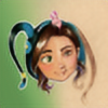
Part of the Mad T Party stage & the White Rabbit DJ at Disney California Adventure.
Brush pen & Prismacolor pencil
Brush pen & Prismacolor pencil
Image size
1096x1471px 3.41 MB
© 2012 - 2024 ArtbyMaryC
Comments2
Join the community to add your comment. Already a deviant? Log In
Nice work... love the colors and the way they blend
together. Good composition too! One would think that
you are an illustrator using strong contour line strokes
and vibrate colors. Keep this concept going...
Overall, I think that the line strokes could be more
consistant. The contrast of the stroke relationship should
shifted a scale. For example: The smallest stroke in
the background i.e. man/shirt and the largest stroke in the foreground i.e. table/speaker should dramatically shift more.
What I enjoy the most about your work is the details put in it. The green "T" contrast is a nice touch and my favorite. Even though I may sound like I know a lot or nothing at all. Keep improving, keep creating and never stop inspiring!